
|
Help | | | News | | | Credits | | | Search | | | Guestbook | | | Forum | | | Shop | | | Contact Us | | | Welcome |
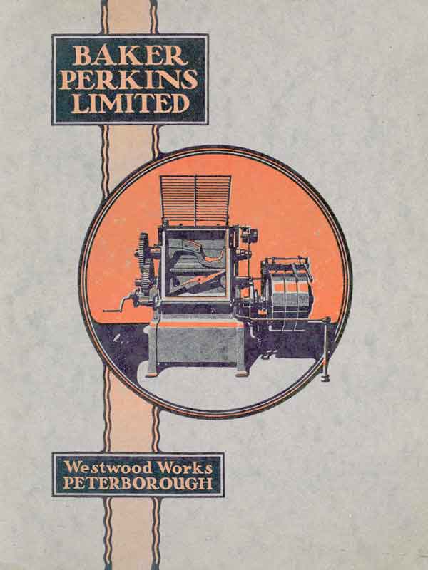
Westwood Works 1903-2003 |
|||||||||||||||||
This section looks at how the Company's corporate image developed from the Joseph Baker & Sons/A.M. Perkins & Son/WP&P era into the APV Baker days through the design of the Company's logos and machine name plates.
The Time-Line featured in History graphically represents the growth of the Company in Peterborough and features specific noteworthy milestones in the Company's development. Featured are some of the company logos used at different times in its development. Each logo was an attempt to promote a particular corporate image and reflects, not only the industry style of the time but also a growing confidence as evidenced by the increasingly clean and simple designs used in later years. Indeed, the "pregnant golf ball" BP logo has been described by many ex-employees as THE definitive symbol of the Company, still recognised in all corners of the world.
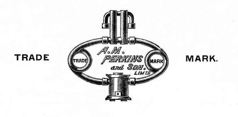 |
A.M. Perkins & Son Ltd. was formed in 1889 so this logo dates from sometime between then and 1893 when the company was taken over by Werner and Pfleiderer to form Werner, Pfleiderer & Perkins Ltd. The logo is clearly of its time and obviously attempts to reflect the main activity of the company heating systems. |
 |
A Joseph Baker & Sons "letterhead logo" from 1896 that makes a clear, no nonsense statement. |
  |
These were in use both before and after the move to Westwood in 1904 and possibly date from the merger with A.M. Perkins & Son in 1893. Something very similar to the WP&P logo was still in use by Werner & Pfleiderer, Germany throughout most the 1900's. |
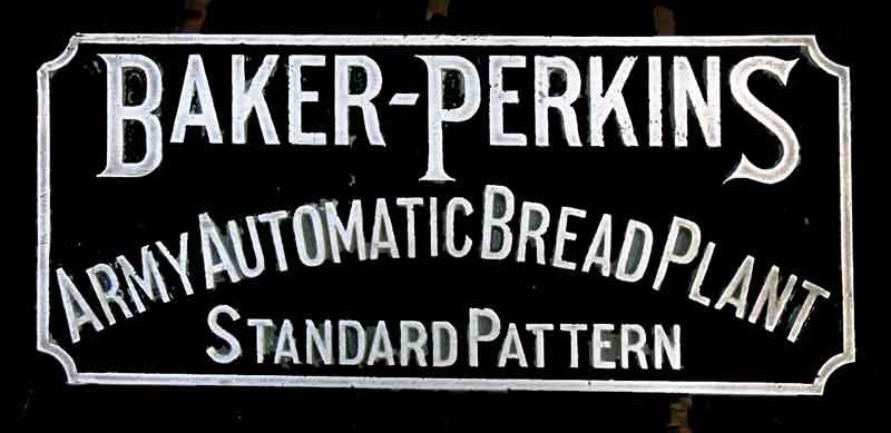 |
Mention is made in "How it Was Westwood Works at War" of the pre-merger co-operation between WP&P and Joseph Baker & Sons in the supply of complete Field Bakeries during World War One. It is believed that this machine nameplate dates from that period. The wording used is exactly as described in Augustus Muir's book. |
 |
A rather odd logo, probably reflecting the euphoria and self-confidence following the renaming in 1923 of the two companies that had merged in 1919 to form Joseph Baker Sons and Perkins. |
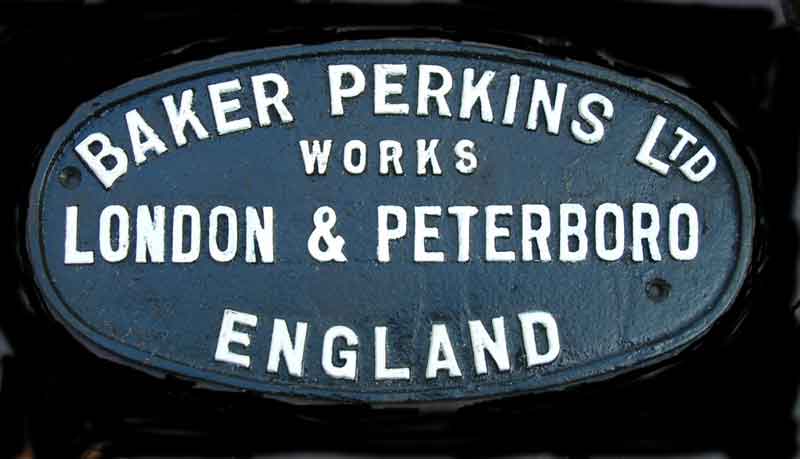 |
As this machine nameplate includes "Works" and the locations in the order "London & Peterborough", it probably dates from the time that Willesden was still in existence. This would suggest a date between the re-naming (1923) and the move from Willesden to Peterborough in 1933. |
 |
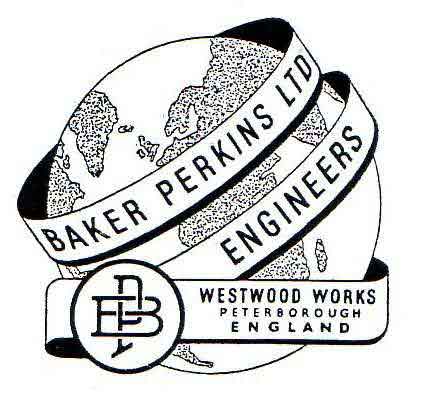
This probably dates from the same period as the above but judging by the style, perhaps from closer to 1933. It is interesting to note that the plate is almost identical to that shown on the "Turboradiant" oven depicted in the "Time-Line" from the 70's, the difference being that the locations are reversed "Peterborough & London". As all of the London-based Baker and Perkins manufacturing facilities had long disappeared by the 70's, it could be inferred that "London" referred to the Export Company (see The Export Company). |
   |
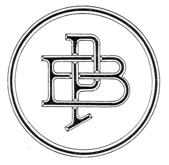
It is possible that all of these are from the period between the renaming of the company in1923 and the move from Willesden to Peterborough in 1933. |
 |
This logo rings us closer to the style of later logos but certainly has a 30's feel about it. Arguably the start of a very self-confident period in the company's history no longer felt to be a need to spell out the company name. |
 |
A cleaner and sharper version of the above. It is thought that this logo existed during WW2 (see Documentation) but certainly was being used in 1948. It is thought to have remained in use for various purposes at least until 1966. |
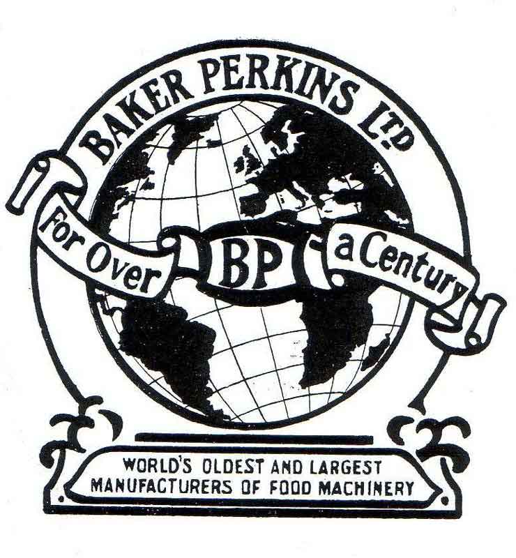 |
"For over a Century" the "World's Oldest and Largest Manufacturers of Food Machinery" - exuding confidence the company faces the challenge of the post-war years. Introduced in 1946, a slightly modified version can be seen on some of the internal documentation in "How it was Documentation" from the period 1949 to 1951. |
 |
The Company as a world player in 1950 to 1952. "Baker Perkins World Engineers" was the title used many years later in 1984 for a corporate film, copies of which can still be obtained, transferred to video (see News) |
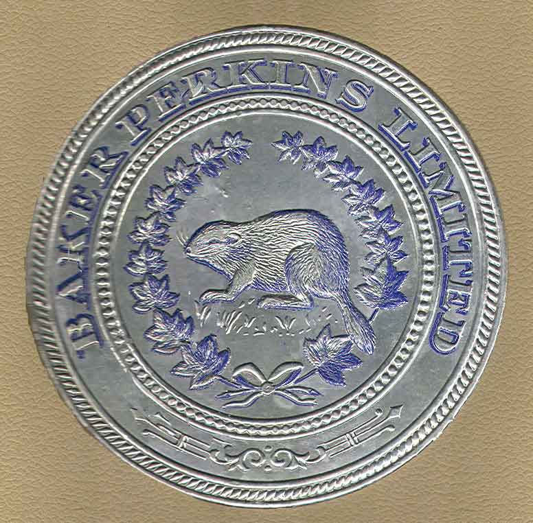 |
Known to have been used for company purposes from 1958 to 1971, the "Beaver" device was also featured on Westwood Works Sports Club badges (see Sports Club Activities). Presumably, the beaver is a reference to the Ontario, Canada origins of the Baker Family. |
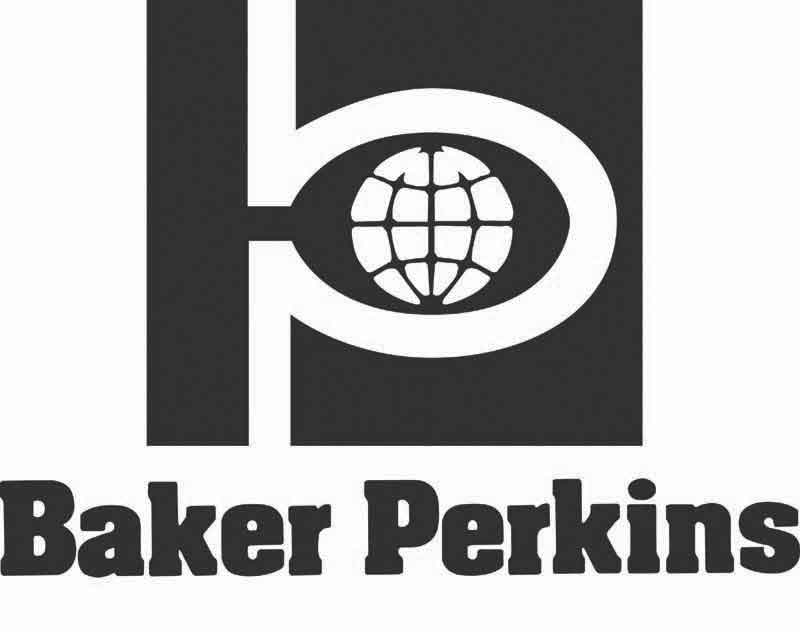 |
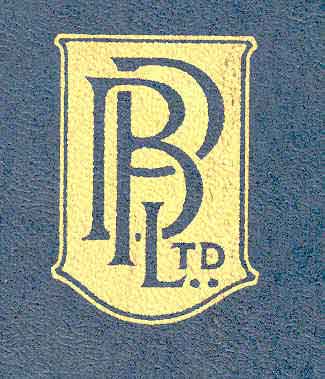
The ubiquitous "Pregnant Golf ball". This was the most long-lived and perhaps most widely recognised symbol of the company. Introduced in around 1962, it remained in use until the time of the merger with APV in 1987. The colour changed in 1964 from Kingfisher Blue to "Blue-Green" and the associated "Baker Perkins Limited" typeface might have undergone some modification over the years but the logo itself remained virtually the same, appearing on just about everything that had any connection with Baker Perkins. |
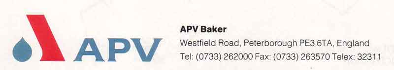 |
Following the merger in 1987 with APV, there was much discussion as to the name and style of the new company (see Group Newspapers). After a long and detailed study a completely new "corporate image" was launched of which the stylised "A" was a key feature. Made up of a solid bar and a drop of liquid, it was said to encapsulate the marriage of the Baker Perkins (solid food machinery) and APV (liquid food machinery) businesses. There was one small hiccough when it was realised that the "A" was similar to the logo used by a prominent Danish bank but any conflict was soon smoothed over. |
 |
The use of the APV Baker logo continued at Paston until April 2006 |
 |
With the sale by Invensys of the Paston and Grand Rapids, USA businesses to private investors John Cowx and Brian Taylor in April 2006, the newly independent company reverted once again to the name - Baker Perkins. |
Baker Perkins was acquired by Schenck Process Group in November 2020. The Baker Perkins name remained, with the logo changed to SPG's corporate colour - also a Baker Perkins corporate colour from the 1970s. |
All content © the Website Authors unless stated otherwise.